Capital One · Auto Refinance
Redesigning the auto refinance journey
Rebuilding a high-stakes application to win back mobile users
Mobile brought 2× desktop's traffic but converted far worse. I rebuilt the journey around trust: +7.2% sign-in-to-submit, +4% application-to-contract, worth ~$200MM in annual originations.
Mobile was winning the traffic and losing the customer.
Exit surveys with 1,000 drop-out customers and call-center interviews surfaced three pain points that set my design goals.
More screens, less thinking.
One long, unpersonalized page with a confusing order for co-borrowers, overwhelming on mobile, where most people now started.
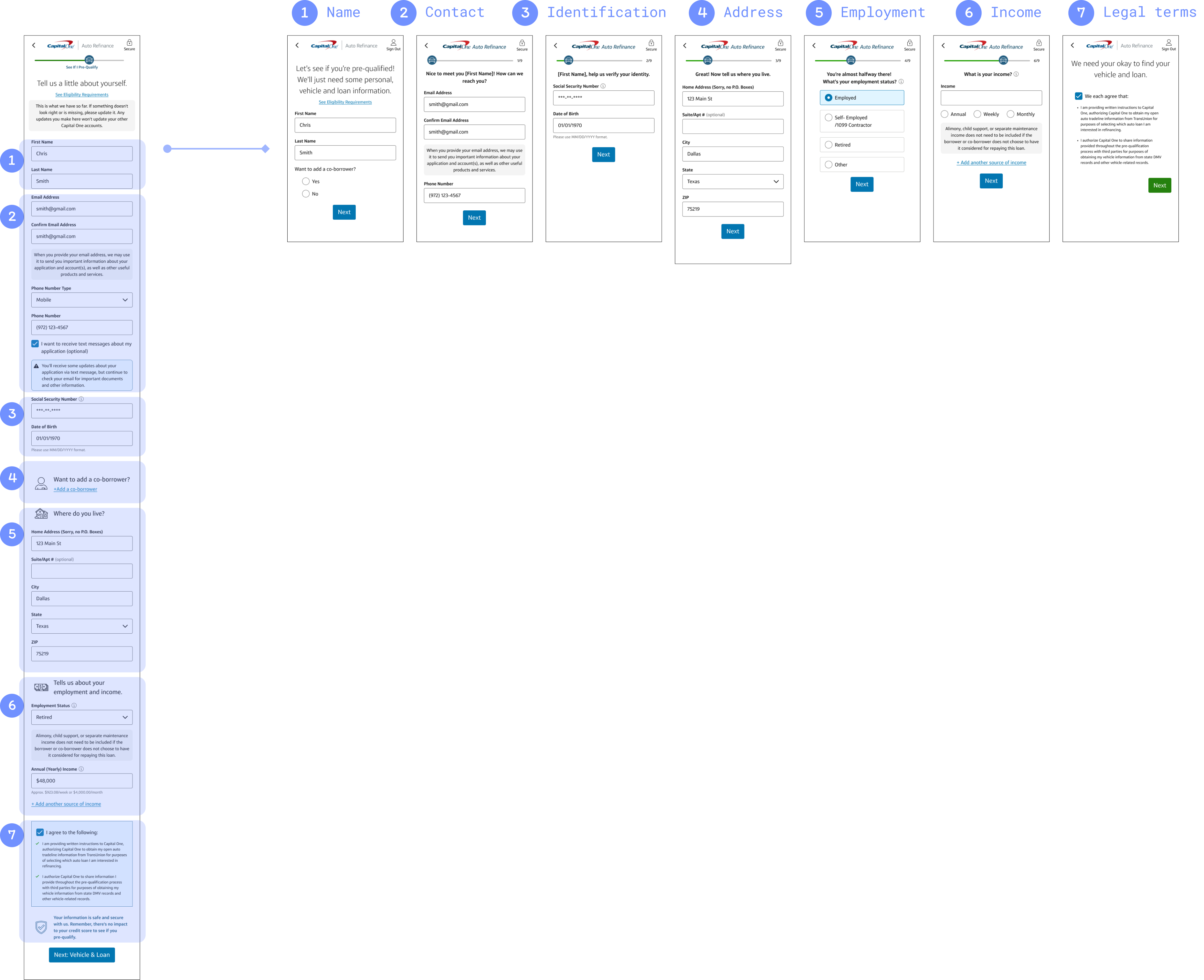
Before
After
- →+7.2% lift in sign-in → submit rate (top of funnel)
- →+4.7% lift in sign-in → signed contract, end to end
- →Became the new control for both mobile and desktop
Honesty beat the hard sell.
At the moment of committing to a hard credit pull, users hesitated, unsure what they'd actually save, and wary of a 'salesy' pitch.
Before
After
- →+4% lift in application → contract rate at this step (statistically significant)
- →≈ $200MM incremental annual originations and $3.5MM marginal NPV annually
The last step is where people quietly give up.
Income verification (via Finicity) was confusing and easy to abandon, especially for joint borrowers, so adoption sat low at 26%.
Before
After
- →Finicity adoption rate increased from 26% to 37%
- →Exit surveys pointed to more bank options as the biggest next opportunity
The decisions, and what each one cost.
Every screen asked for more trust than the last.
The wins compounded: +7.2% submit, +4% to contract, Finicity adoption up 11 points. The through-line was never a flashier pitch, just telling people where they were, what they'd save, and what came next. That work earned Capital One's “I am Giant” award.