Capital One · Data Platform
A system of record for data usages
An internal system of record that replaced a costly third-party tool
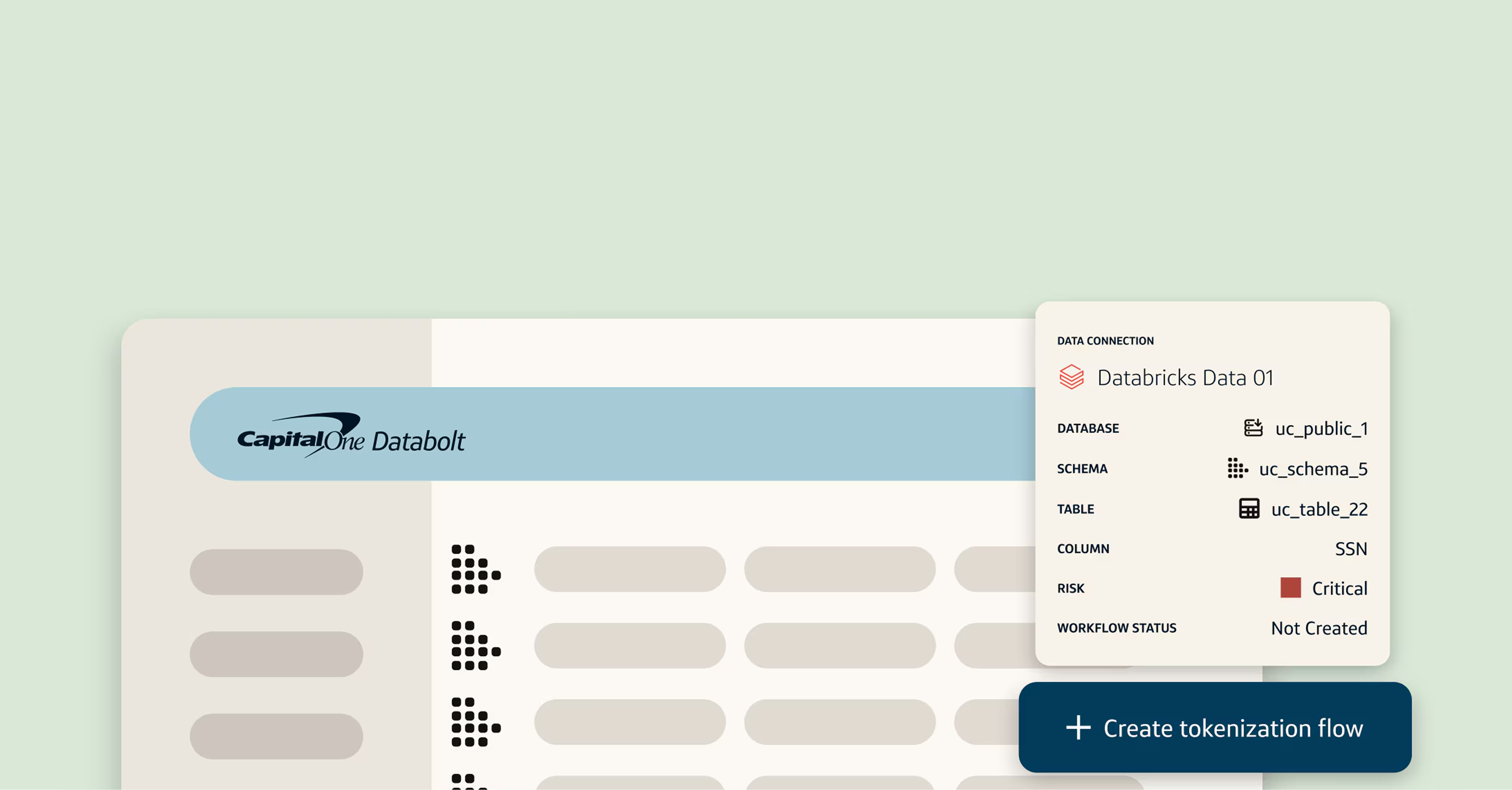
Sole designer on 70+ screens, building the system of record for ~4,000 data usages that let Capital One decommission a costly third-party SaaS tool.
Nobody could say what the data was actually used for.
I designed for the analysts and engineers who need enterprise data that's easy to govern, find, and trust: a new system of record for “data usages,” the reports, models, and systems that consume data to serve a business purpose.

A data usage consumes elements from one or more datasets to produce an output. Here's an example.

We were paying a vendor for workflows nobody wanted to use.
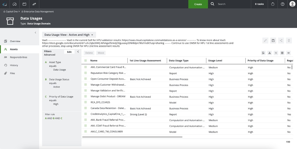
Capital One used a third-party tool to manage ~4,000 data usages, including hundreds of high-priority usages and tens of thousands of high-priority data elements. Workflows were disconnected from the internal data platform, the UI was slow and manual, and the vendor was migrating to a costly SaaS model.
We chose to build a new system of record, integrated into Capital One's internal data platform, for cost, control, and the customization a bought tool couldn't offer.
Timeline
Onboarding to production launch and full decommission of the third-party tool in ~9 months (mid-2024 to mid-2025).
My role
Sole designer across 70+ screens. I led end-to-end desktop design in tight “parallel-path” lockstep with product and 5+ engineers.
So I took the old tool apart to see what it was hiding.
I reverse-engineered the old tool, mapping every flow, pain point, and requirement, then studied our internal patterns so new ones would align. The audience was broad: first-line consumers, producers, and leadership, plus second-line stewards, risk officers, and validators.
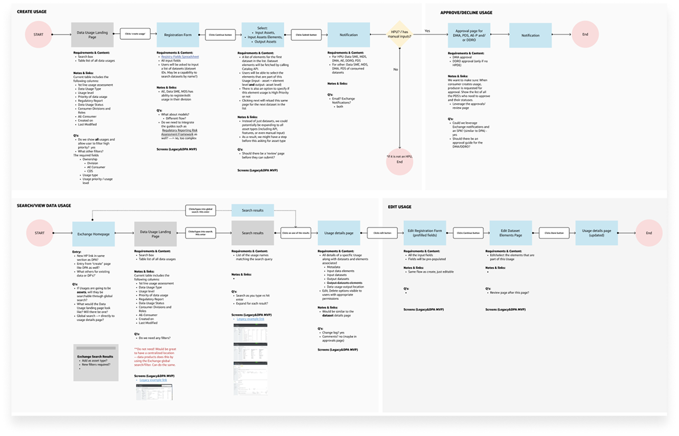
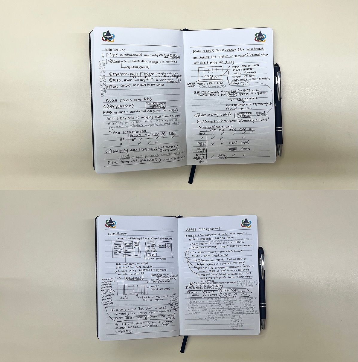
The decisions, and what each one cost.
From emailed spreadsheets to a guided flow
The old tool made users hand-enter up to 3,800 elements into spreadsheets and email them to admins.
Drawer to drill into a dataset without losing the full list.
A color-coded system for governance
Color-coded status, priority, risk, and assessment badges made dense governance easy to scan.
Owners got a dashboard to review, filter, and act on every usage. I aligned it with senior leadership repeatedly, since executives would approve inside the tool themselves.
Prioritizing what people actually needed
A card sort showed status and mapped datasets mattered most.
Mapped datasets lead, with a color-coded status bar on top.
We turned the vendor tool off.
I shipped a new internal data-usage inventory built in-house and contributed new patterns and component hierarchy back to the platform. Positive early feedback on visibility and governance was enough to fully decommission the third-party SaaS tool.