Eureka Surveys
Designing the #1 survey app on iOS
Working at a startup · Surveys that pay cash
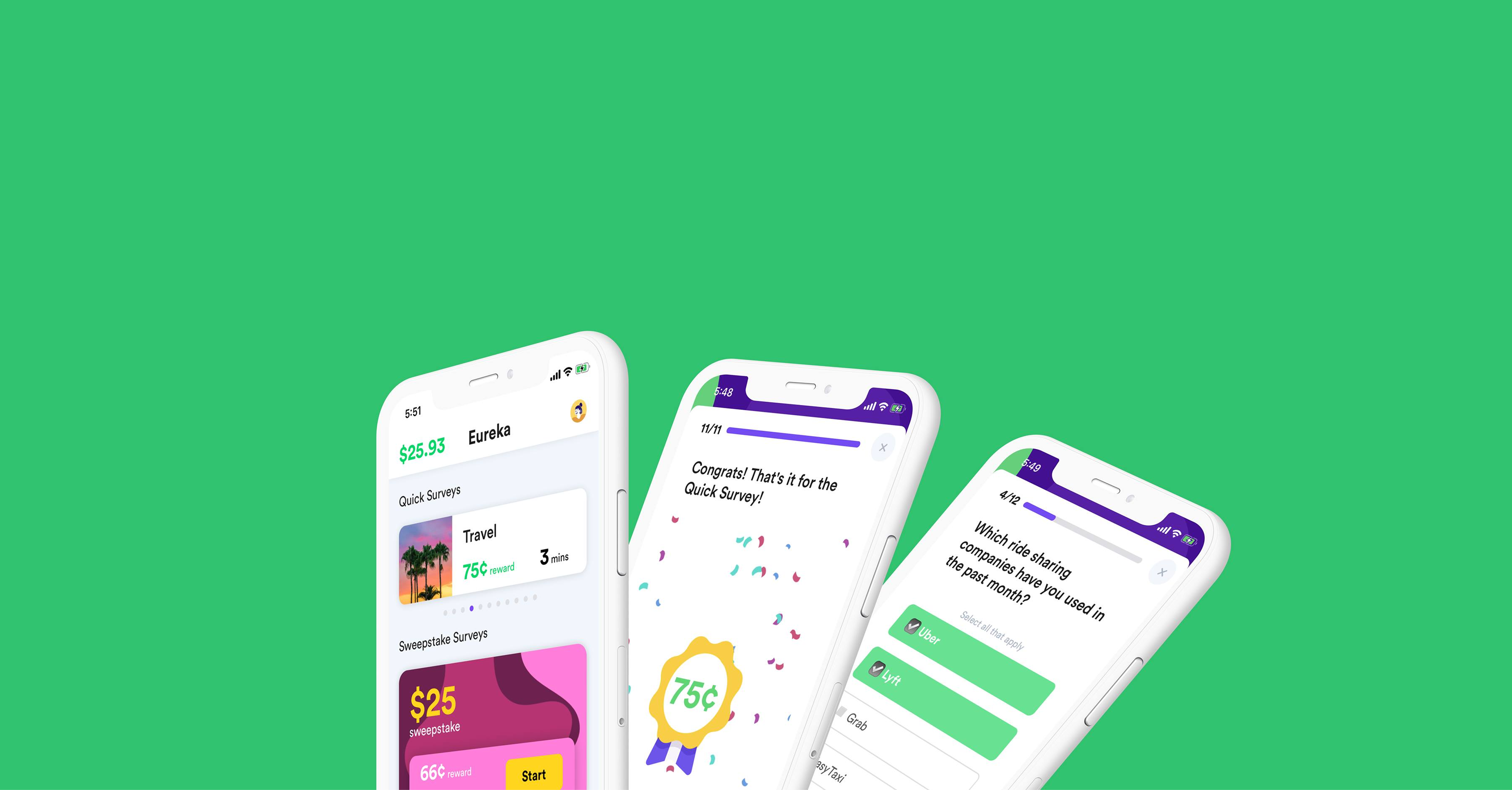
Eureka is a native app and web product where people earn cash and sweepstake entries for daily surveys. As lead product designer at a five-person startup, I ran the end-to-end process from user research to shipping features across iOS and responsive web.
What I did
- Shipped iOS + responsive web screens end to end
- Ran interviews and usability tests with survey takers
- Analyzed competitors to sharpen the earning loop
- Designed the client-side flows for survey providers
- Built the SEO surface: landing, FAQ, blog, and policy pages
How Eureka works
Onboard fast, then steer users to revenue-driving sweepstakes.
01 · Sign up
Web-first, for security
Because this was a cash app, sign-up ran through the web with sensitive edge cases handled up front before users reached the app.
02 · Earn
Three survey types
Quick surveys onboard and profile users; sweepstake surveys generate revenue; daily polls keep people coming back, all with micro-interactions and light gamification.
03 · Cash out
PayPal or gift cards
Once a balance passes $5, users cash out to PayPal or a catalog of gift cards: the payoff that makes the loop worth finishing.
The happy path was easy. The edges were the product.
As the lead designer at a five-person startup, my work spanned research, iOS and responsive web, client-facing tools, and SEO pages. But the decisions I'm proudest of came from the messy edge cases, the moments where a cash app can quietly lose a user's trust. Here are four.
Interruption 1
Survey terminated
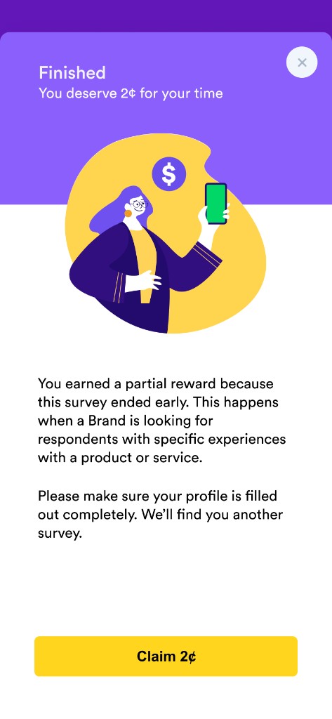
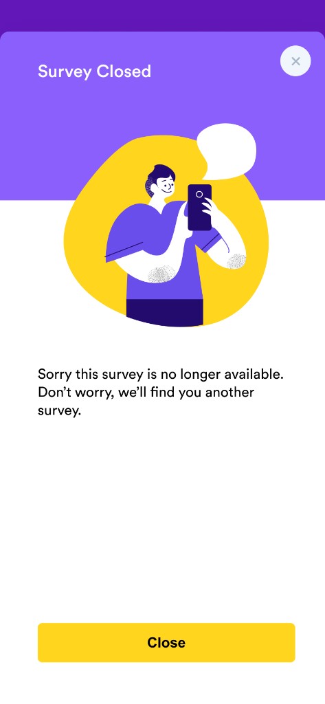
Third-party surveys could cut users off mid-way, with completion as low as 5%. I introduced a “rewards for terminated” pattern: a partial payout when a survey ended short, so effort never felt wasted.
Interruption 2
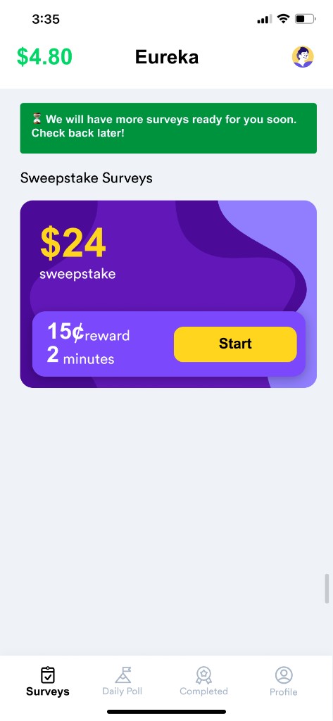
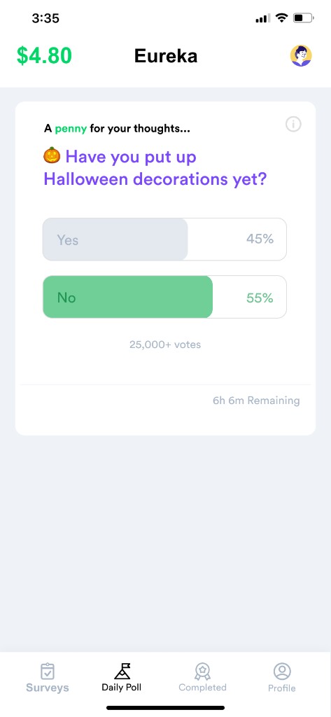
Low survey supply
Supply is seasonal, so an empty home screen can read as a broken app. I used honest banners telling users when to check back or when payouts were high, and added a Daily Poll (one lightweight question) to hold engagement when supply was low.
Interruption 3
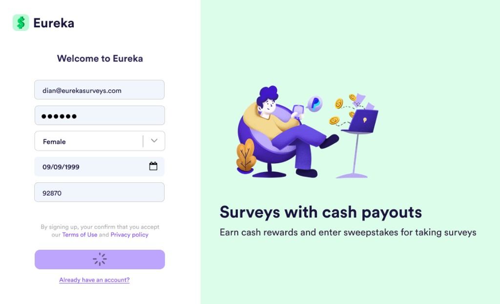
Delayed loading & rage-clicks
Users were rage-clicking the Sign-Up button through a loading modal. I grayed out the CTA and moved the spinner on top of it: a clear signal that the button wasn't clickable yet, which stopped the frustrated repeat taps.
Interruption 4
Unexpected device sizes
Monitoring behavior in LogRocket, we found most web users were on small, vertical Android tablets, not desktops. I re-examined the breakpoints and reworked the offer wall into a sliding layout whenever the device ratio dropped below 1:2.
The early stage of a remote startup taught me more than fast prototyping and clean UI. It taught me how a business actually runs, how design decisions ripple into revenue, and how much good product work happens at the edges no one sees.